

Our packaging derives cues from the architecture and aesthetic of Chandigarh and its creator “le Corbusier”. Le Corbusier, the great “great grandfather” of modernism, had simple principles of design that he executed here. From Chandigarh's aesthetic, we took its use of basic geometric shapes, primary colors and its symbolism, which were put together beautifully by Pushkar Thakur and his team at the grafiosi. Not only did they understand the complete aesthetic and the idea, but also executed in a way which Made it contemporary and truly original.
Geometric shapes - Chandigarh in its entirety, is made up of primary shapes (inundated with the occasional round about (lol)), Our stickers are also in those primary shapes, which we arrange in random patterns to give every bag its unique identity. Hence all the necessary information is displayed without over (albeit some) complication.
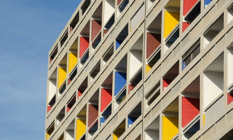
Primary Colours - Corbusier used sparks of bright primary colours to provide relief in an otherwise monochromatic design schematic. You’ll see the same RGBY on our bags as you’ll see on the High court building in our Capitol Complex.

Modernism as a movement, was started for the masses, where art became approachable to all. In spirit, modernism aimed to bring what might be considered a luxury, or only accessible to the bourgeois, to all the people. WIthout going further in circles, which might happen when you traverse the lovely open roads of Chandigarh (commonly referred to as a Gerhi) at BCR Speciality coffee is for everyone. Sounds familiar?